Company: HeliosX Group
Brand: Dermatica
Role: Creative Director
- Brand Strategy
- Art Direction
- Design UX/UI
- Campaign and Marketing
- Digital Product Design
- Packaging Design
Project Overview
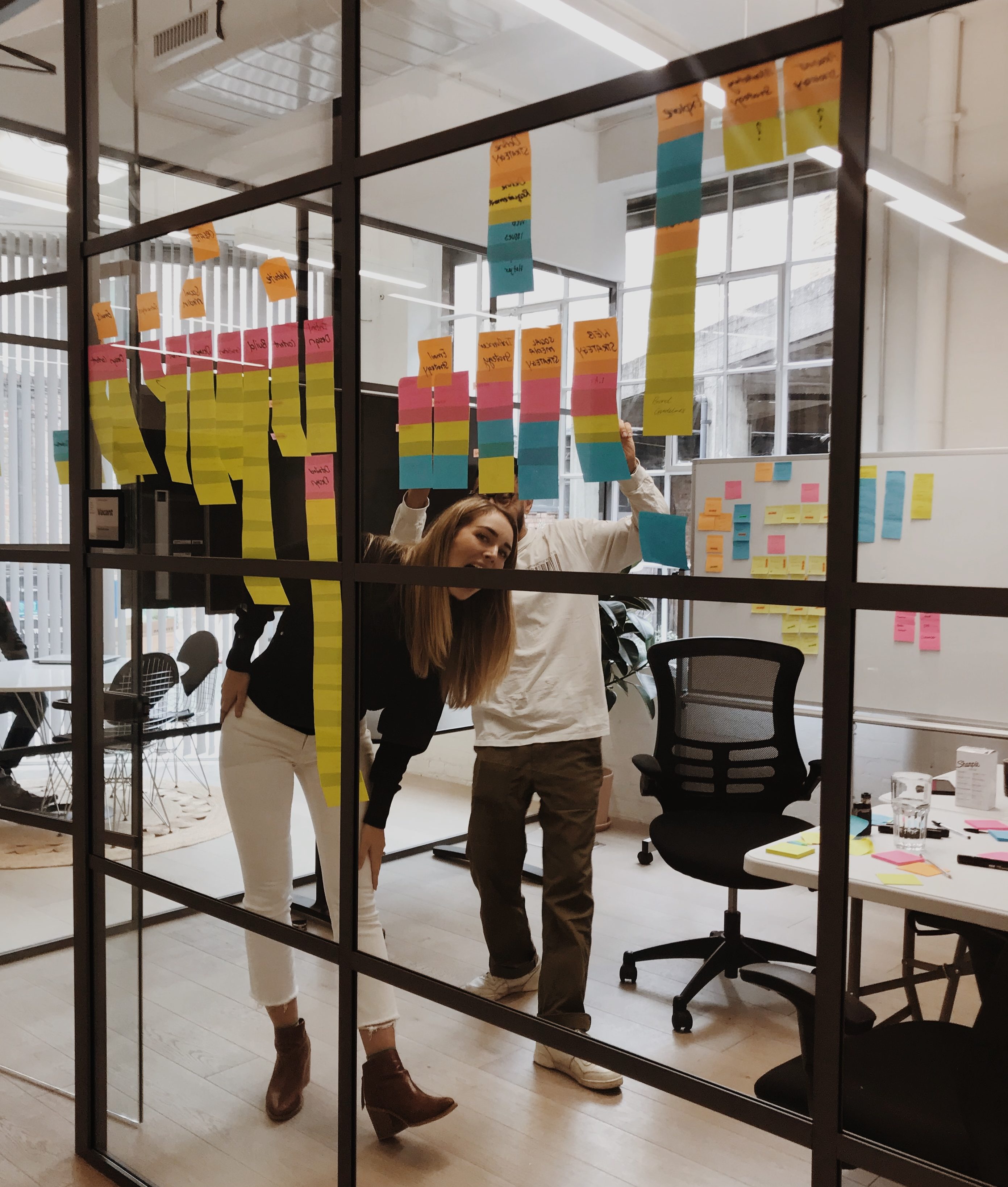
I joined Dermatica to lead a small multidisciplinary creative team, with the brief to create an experience, tone, and brand language that would better represent Dermatica's brand purpose and its prescription skincare and growing product offering. A brand built on the understanding of its customers, and their specific skin concerns, with considerations for both men and women of various ages with different skin goals.


Brand Strategy
Working alongside Design Studio, we set out to create the foundations for a new brand experience informed by our learnings from internal stakeholder interviews with the business leadership and Medical teams. Identifying customer needs and existing pain points through external surveys and social reach out. The initial focus was an evolution of the existing Dermatica Logo, whilst also redefining the brand's TOV and foundation for the new visual language.

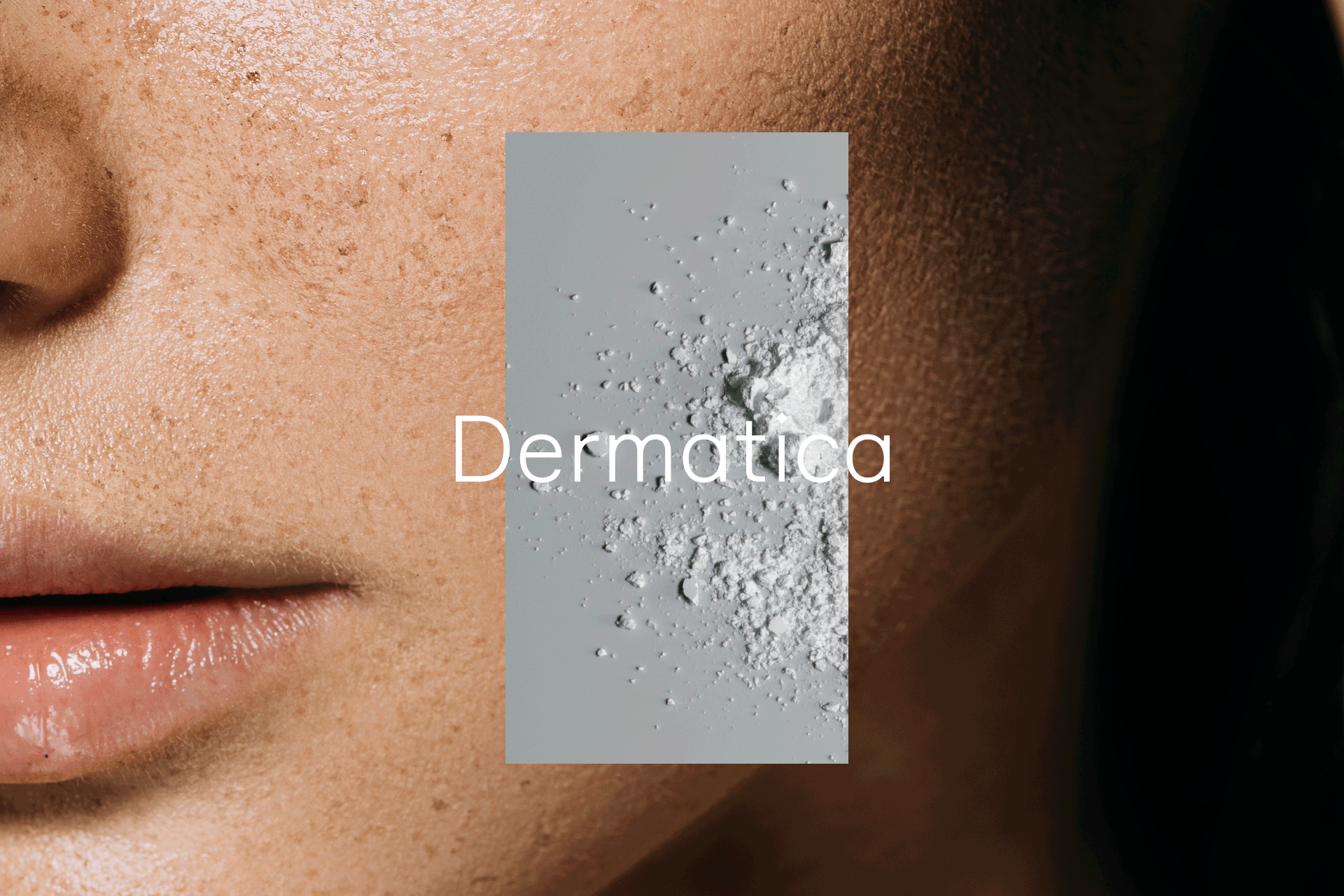
The logo symbol and wordmark
The heart of the brand. It helps demonstrate how Dermatica sees skin differently, and how they bring skin conditions into clarity and focus. Our primary logo is the symbol, which is a formation of diamonds, increasing in size from left to right.
The symbol works well as a static mark but comes to life brilliantly in motion. Here are two distinctive ways to animate our symbol.
1. Wave motion using weight variation
2. Fluctuation of diamonds coming in and out of focus
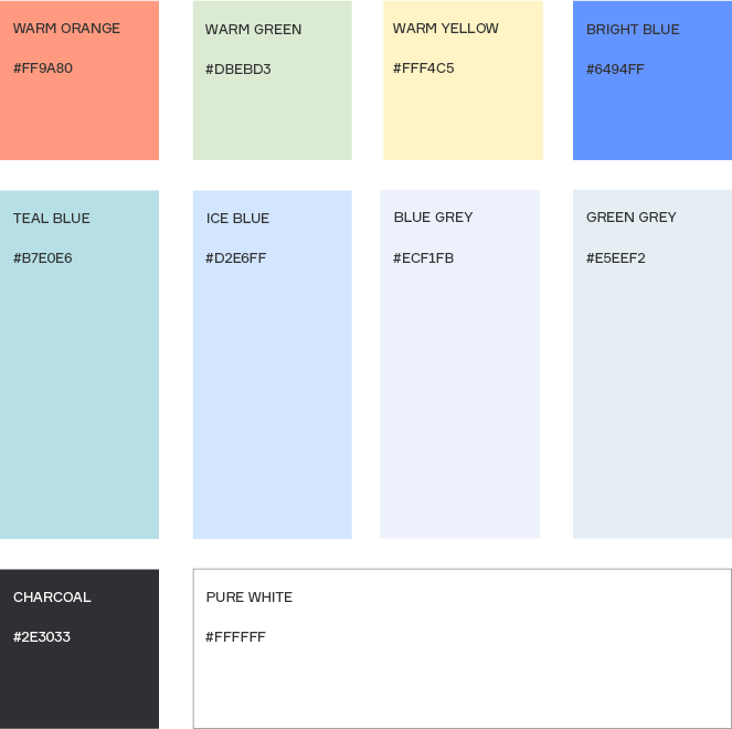
Colour palette
The colour palette features a wide breadth of tones, ranging from subtle to more vibrant. This allows the ability to create confident and clear layouts with moments of bold and distinct expression when needed.
As a general rule, the Dermatica brand benefits from the ample use of negative space and allowing content to breathe.
Typography
Working alongside Brownfox an Independent Moscow-based type foundry, we created a bespoke version of their typeface Formular for a more functional and scientific type kit, drawing inspiration from the footnoting layouts of scientific journals and documents.
The custom typeface created "Dermatica Formular" is perfect for large amounts of information and annotations, or small, quietly confident headlines. In large sizes, it is bold and precise, with interesting, symmetrical forms and softer ink traps.
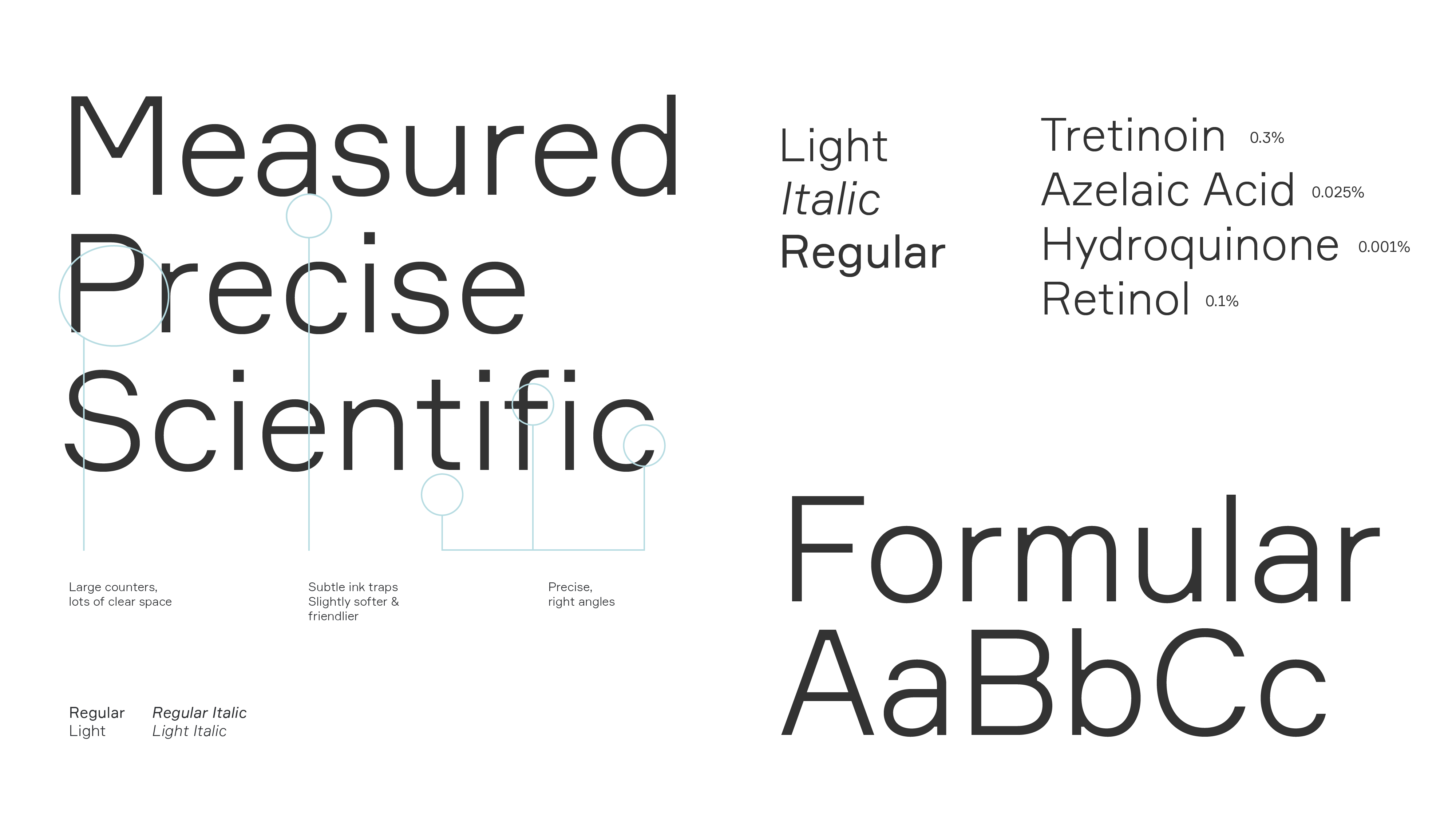
1. Small and confident
2. Large and bold
2. Combination


Art Direction
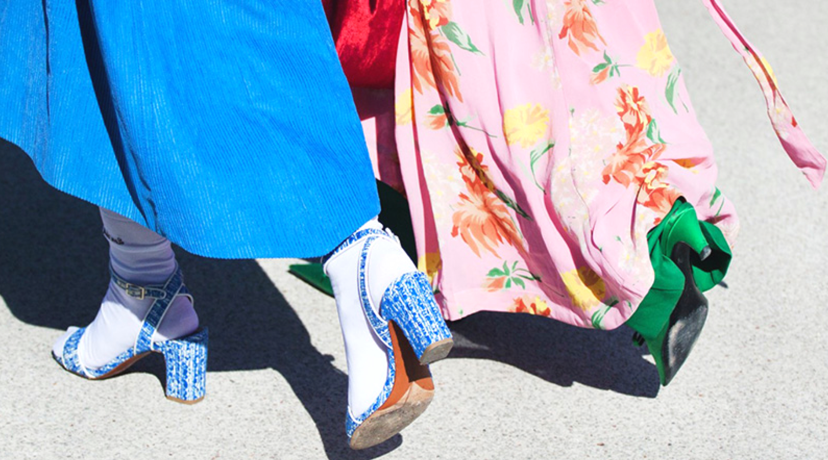
Art direction is a key part of our brand. It’s another visual tool we use to show the world how we see skin differently. these are the four key art direction styles.
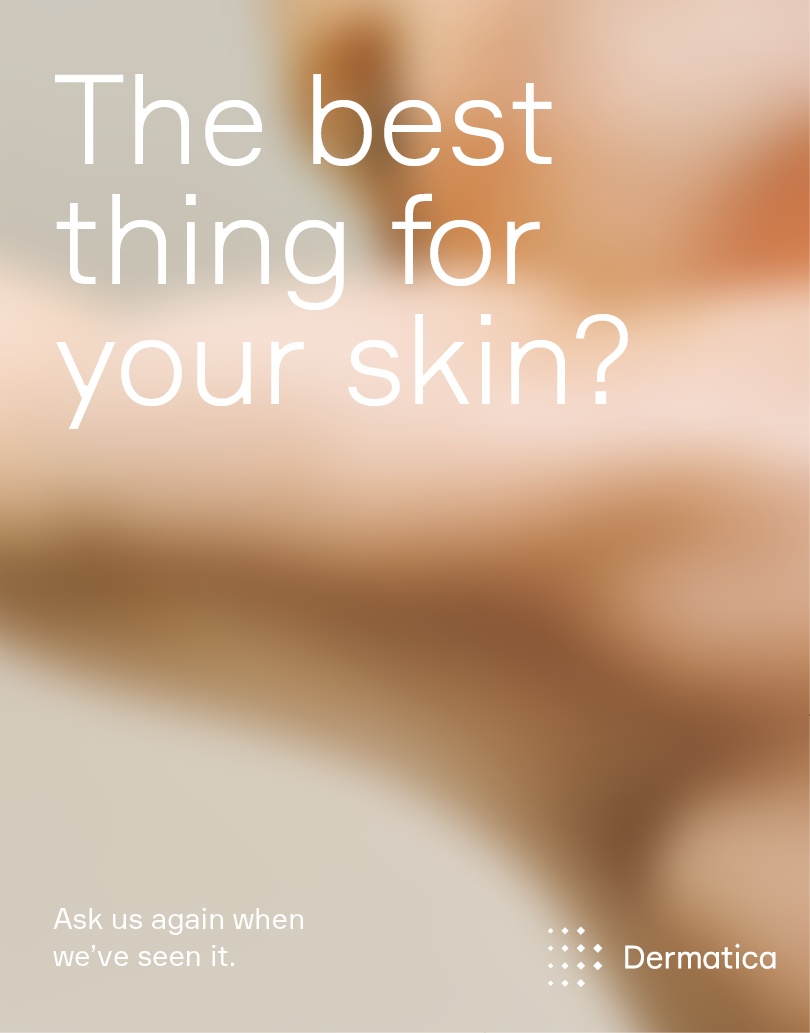
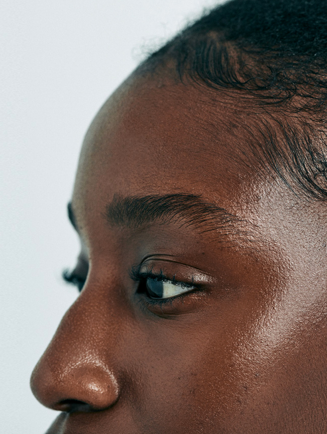
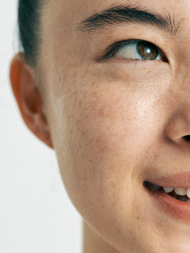
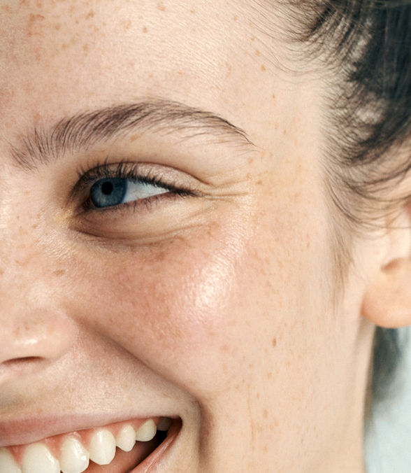
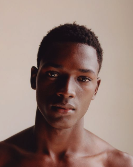
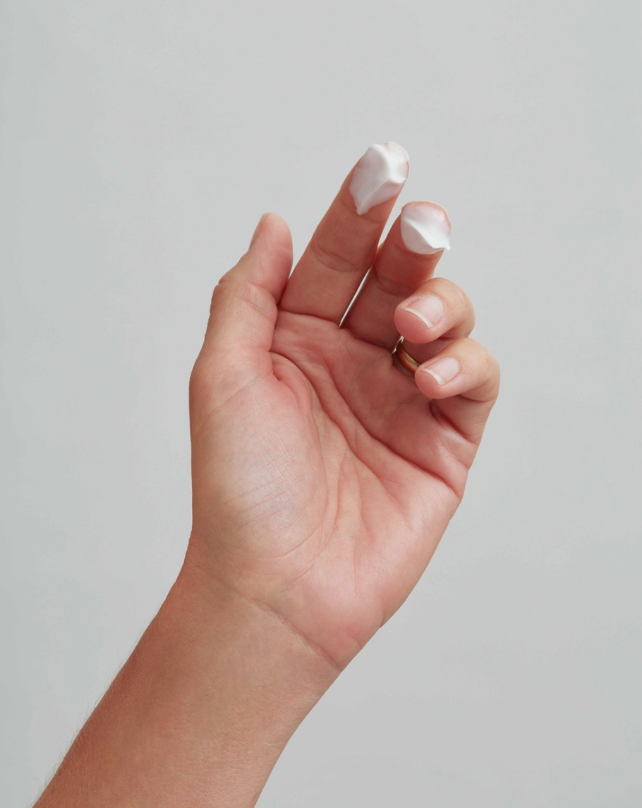
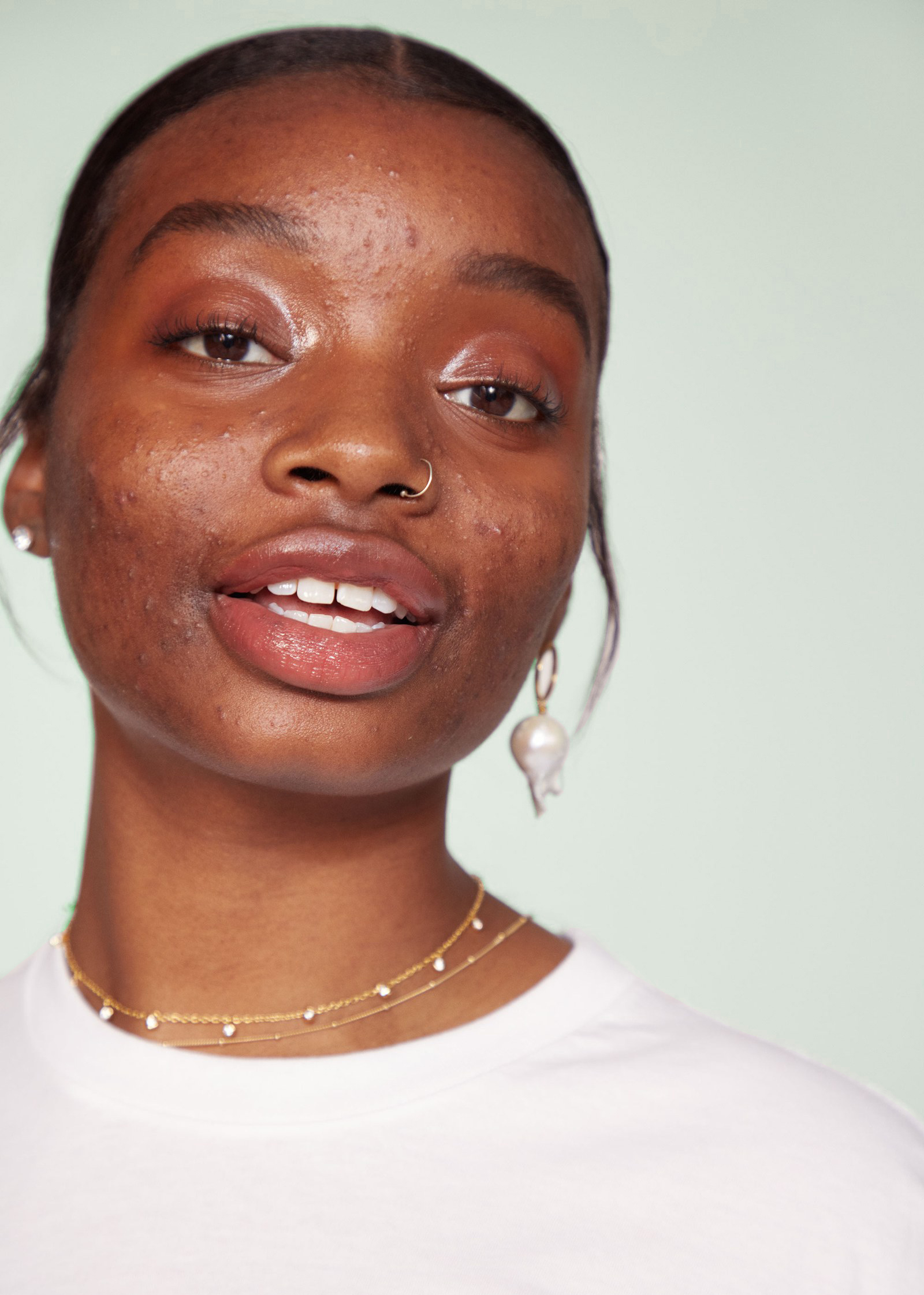
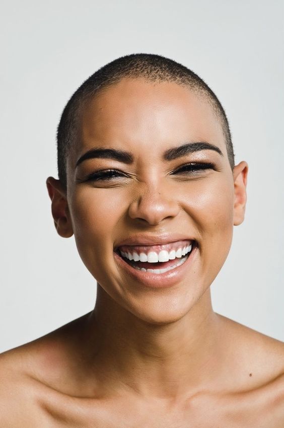
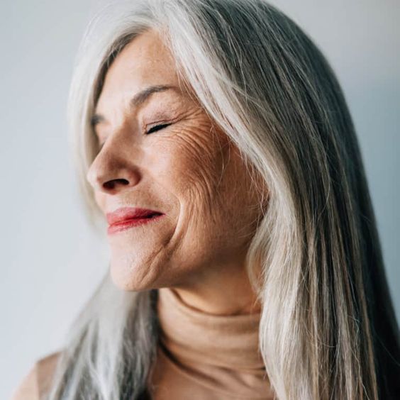
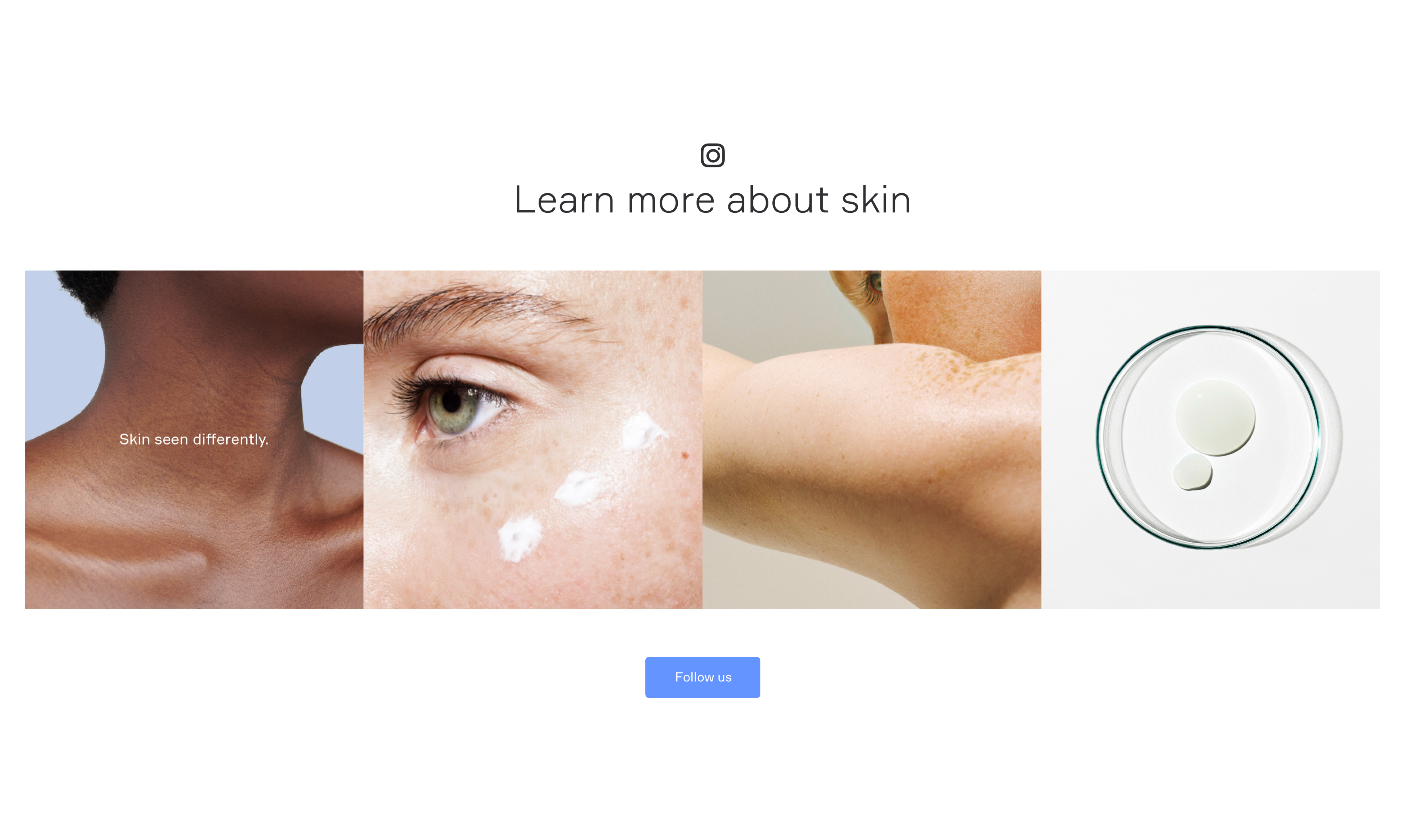
1. Customers
Always photographed in an authentic, honest, positive way, using full colour and natural studio lighting. They should reflect the diversity of skin conditions, skin colours, ages, and genders of the customers we treat.
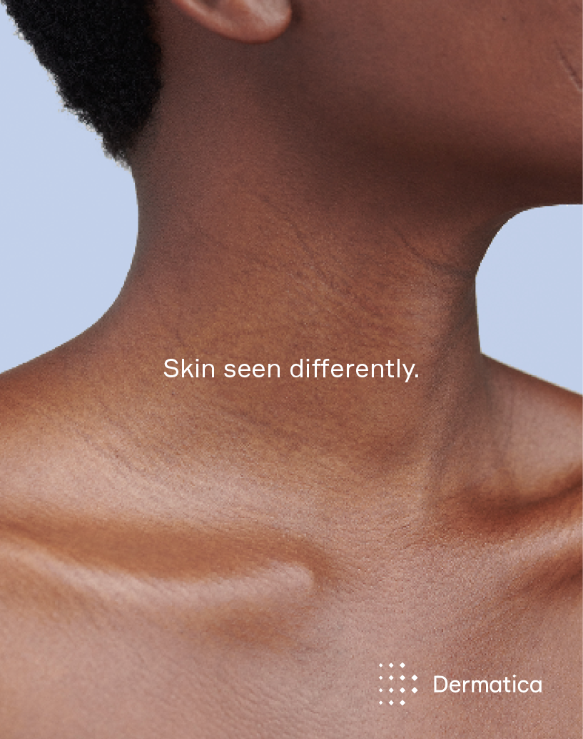
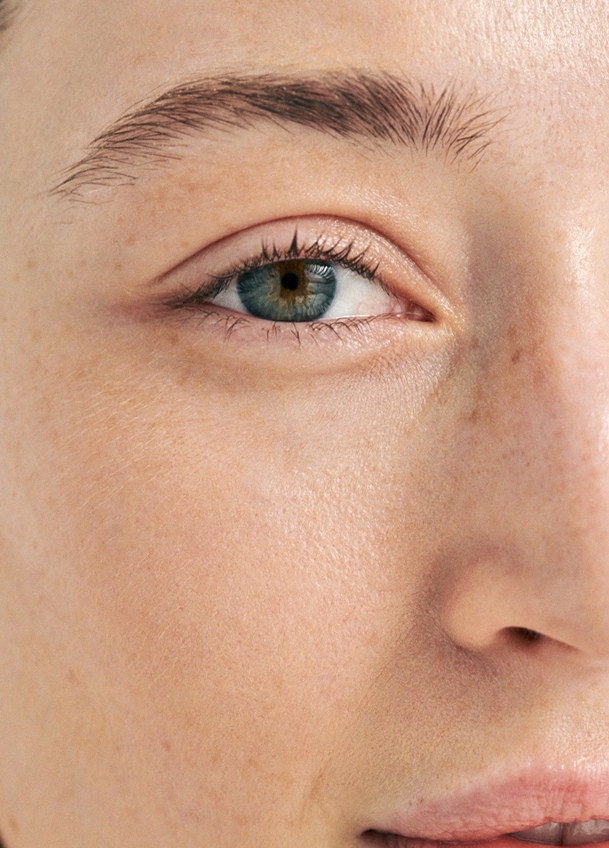
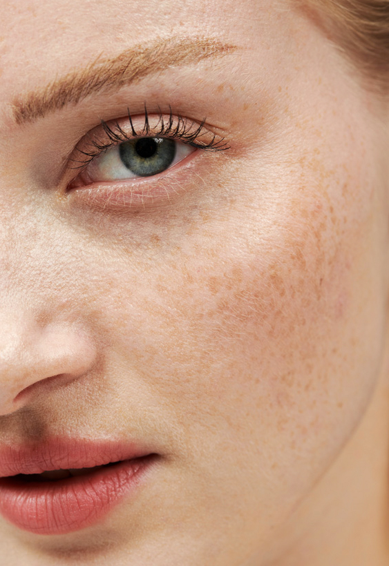
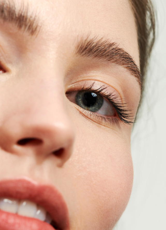
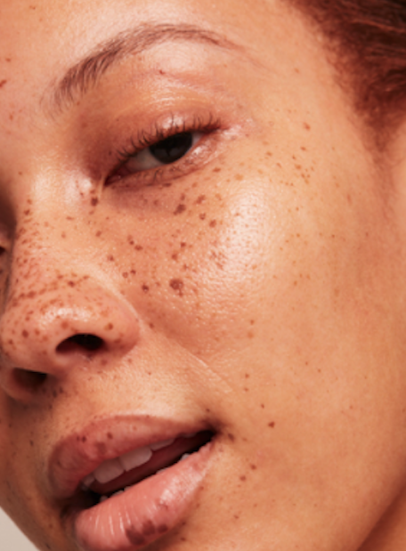
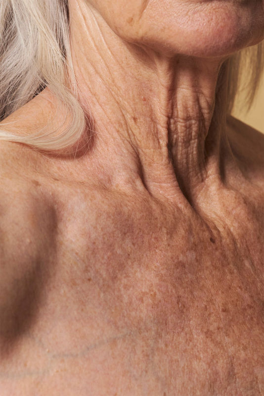
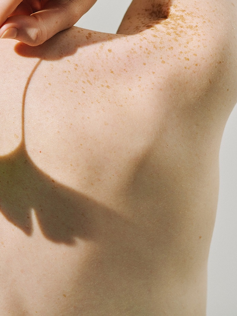
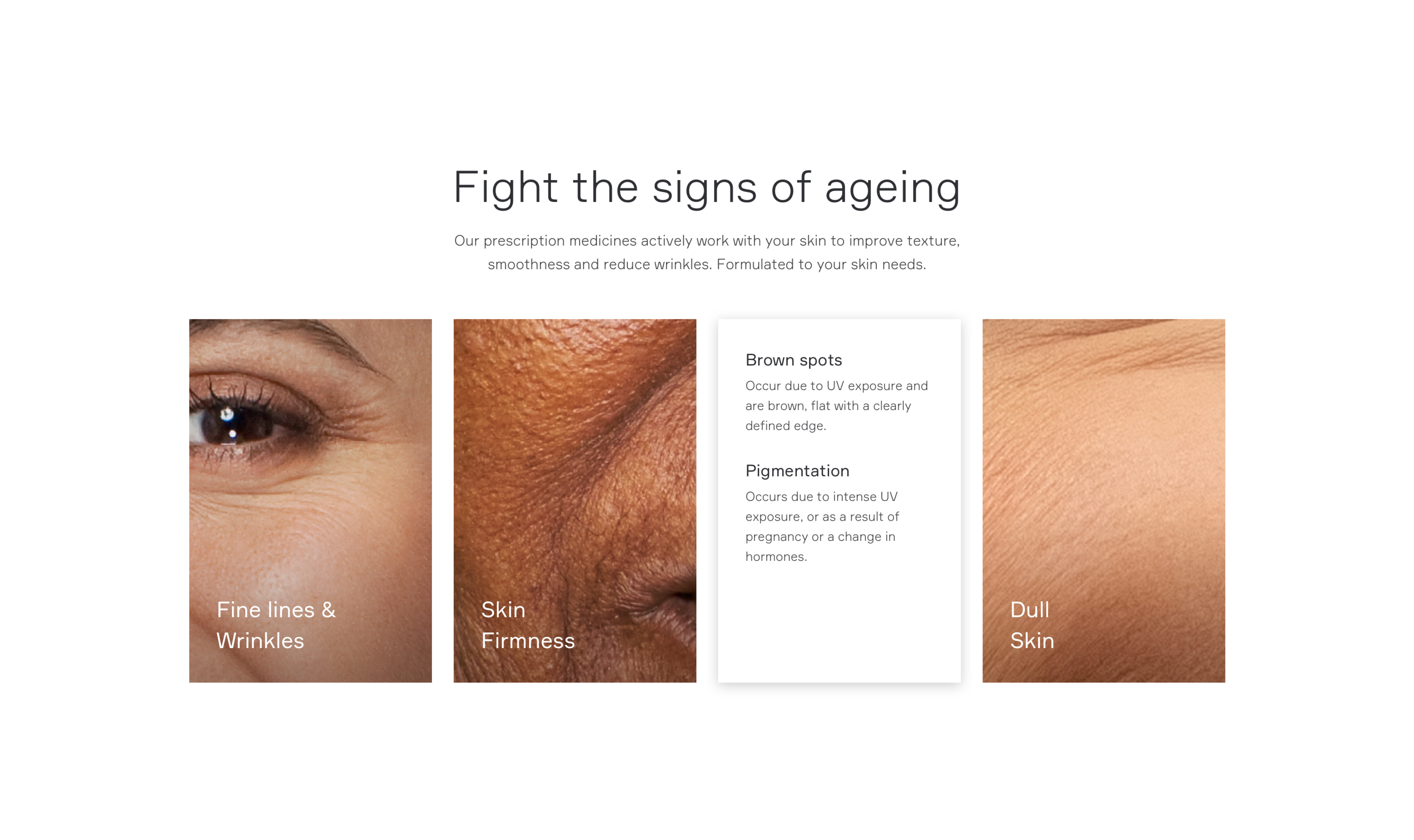
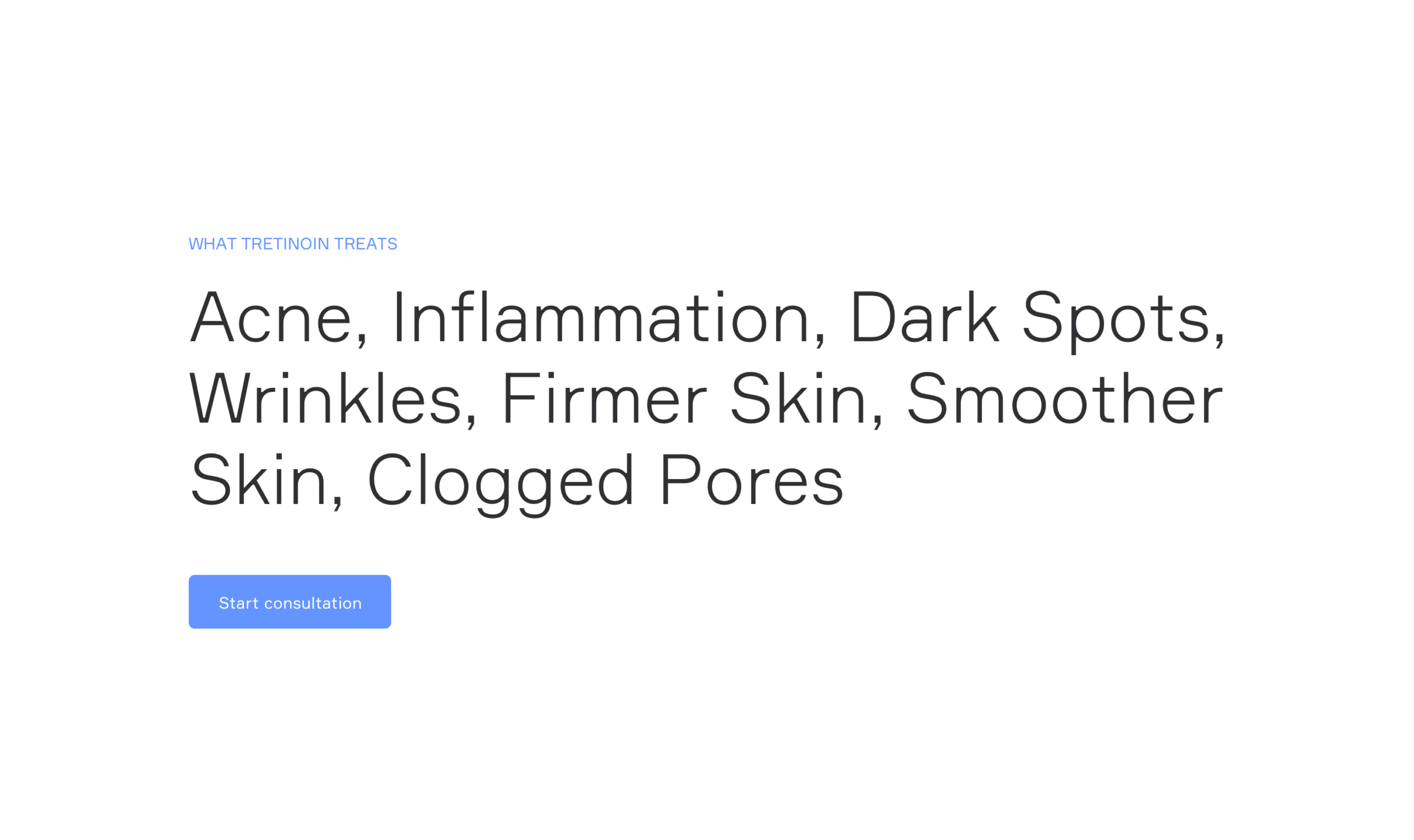
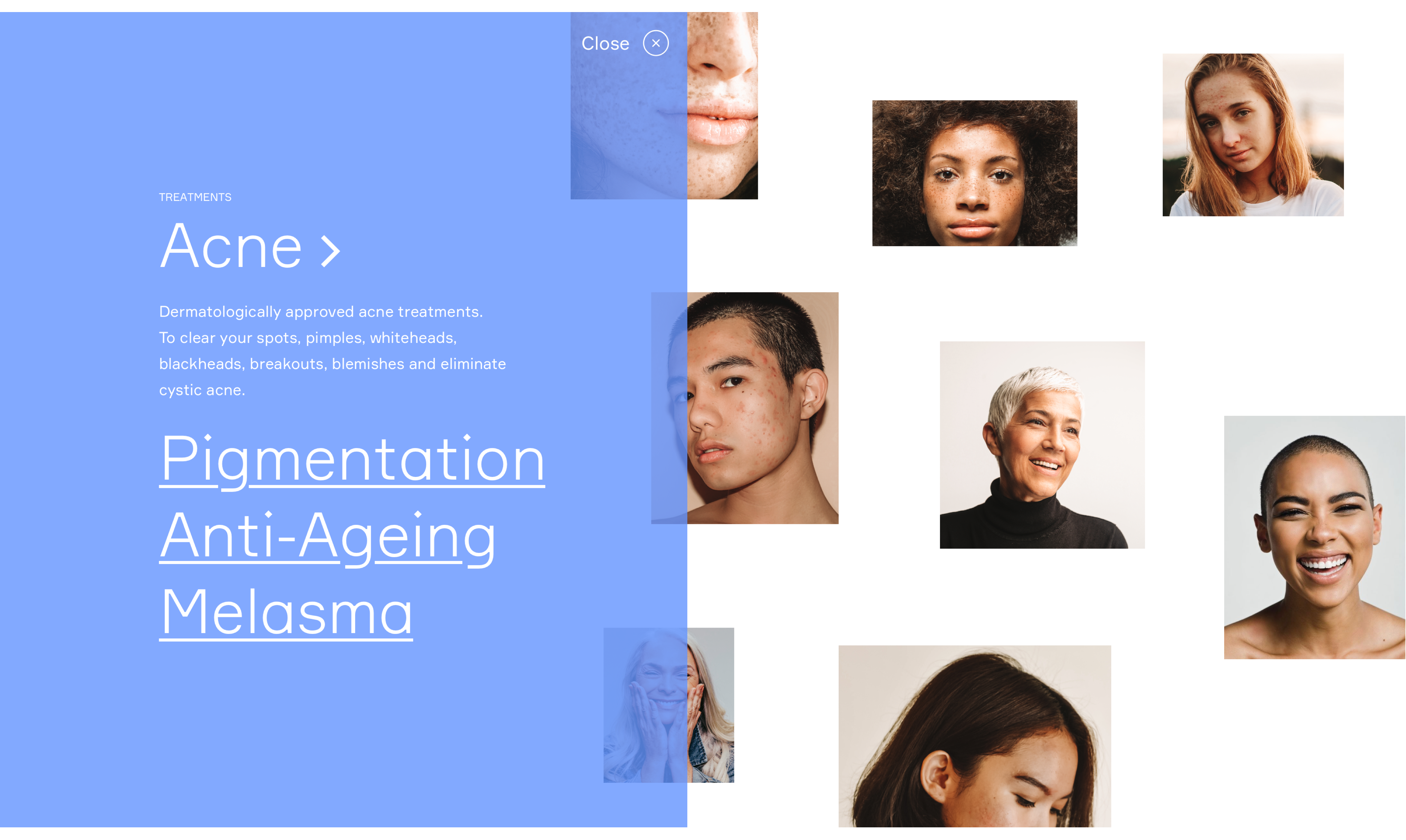
2. Skin conditions
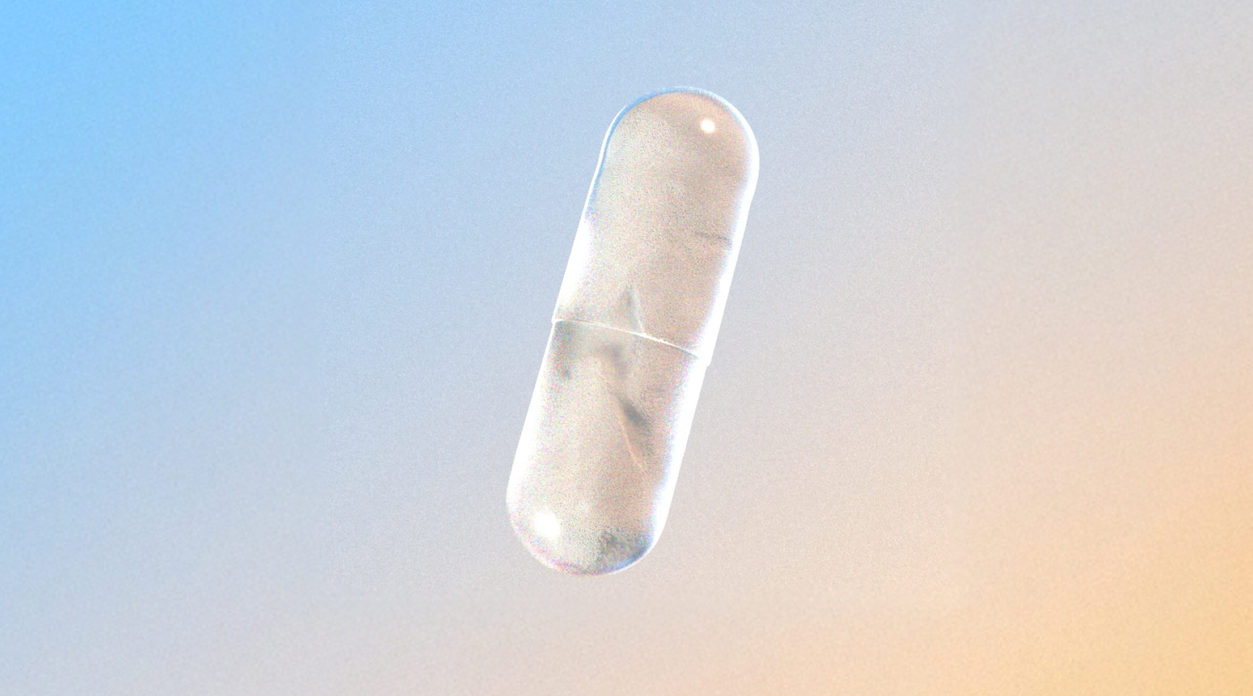
What sets us apart from competitors — this truly represents that we look at skin in a different way. Zooming into parts of the face or body, focusing on different skin conditions, and celebrating the diversity of skin.
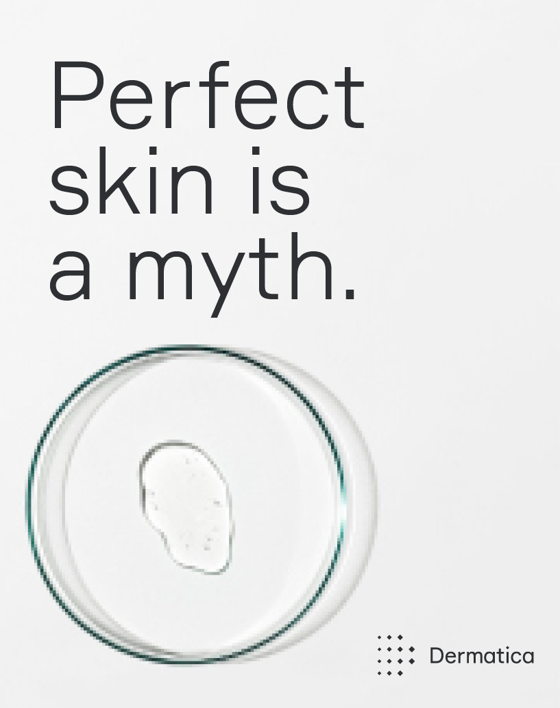
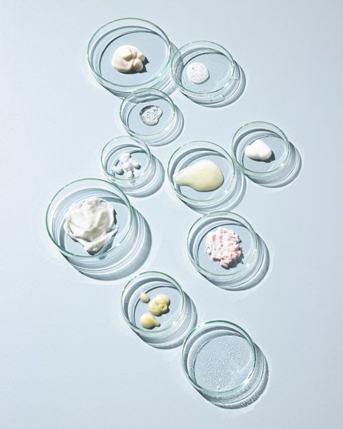
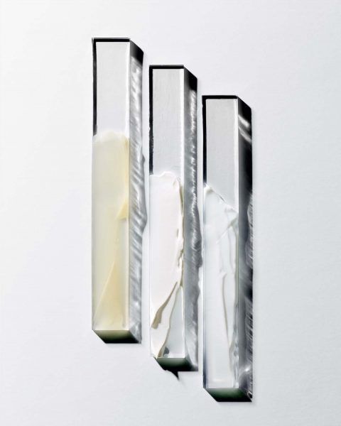
3. Products
We photograph our products inspired by our scientific approach — we always shoot products top-down, as if under a microscope. Lighting should be sharp and strong, as if in a lab.
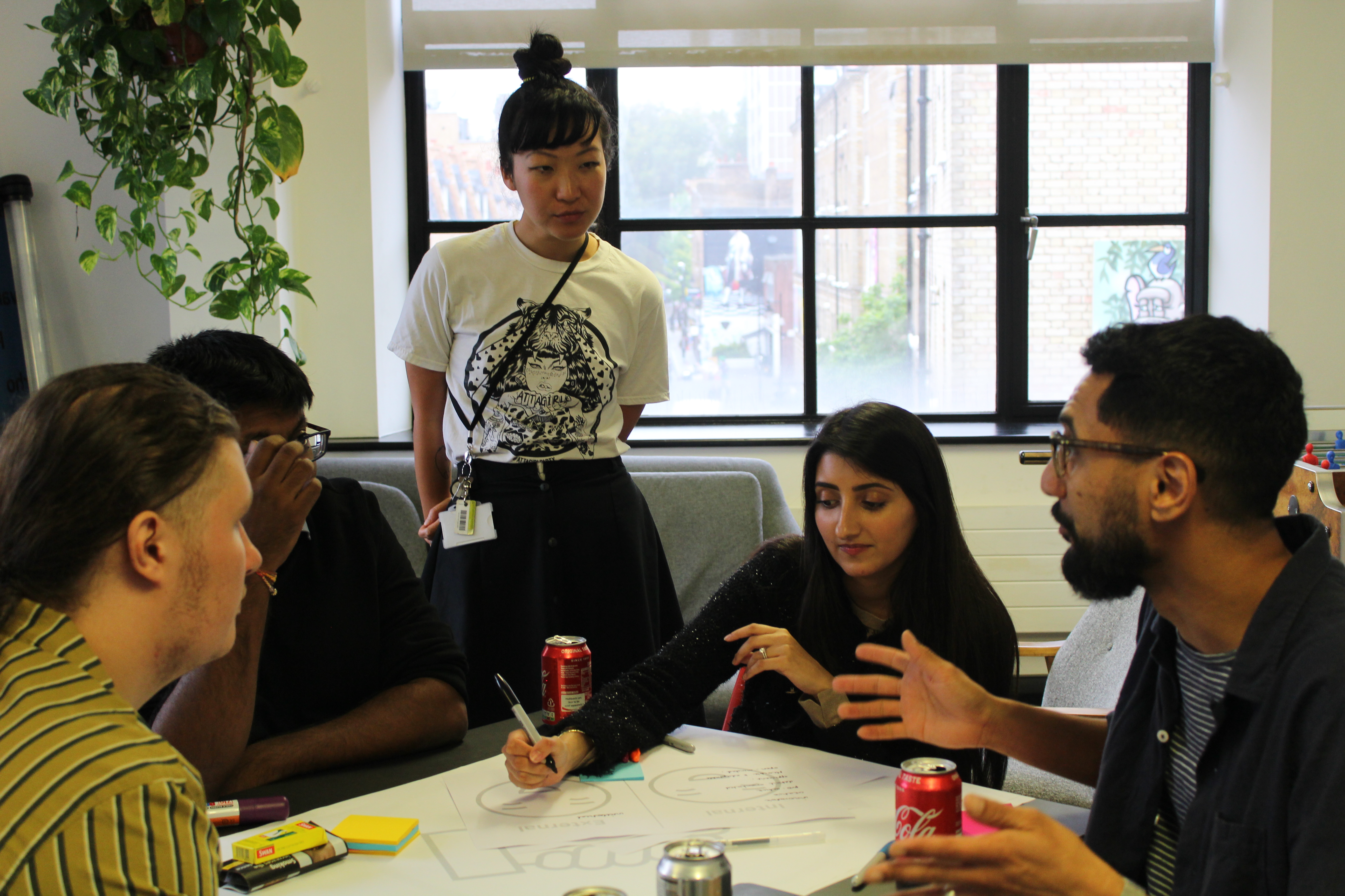
4. Our team
We’re serious scientists, so we should be photographed as such — but we should allow our warmer side to come through.


Motion Principles
We have three key motion principles applied to photography which we use in a variety of digital touchpoints.
1. Zoom
The zoom principle is used when transitioning from one image to another. We use this effect when we transition from a portrait to a close-up of the same subject.
2. Shift
Our shift principle is our simplest motion tool. To be used a simple slow blur to images or as a highlighting device for different body parts using depth of field.
3. Change lenses
Lense change is another transition effect from one image to another. We use this when showcasing two photos of the same subject.

Reimagining the brand experience and global design system
We set out to align the visual design and user experience across all platforms and touchpoints, website, consultation process, automated emails, social, and product packaging.
We'd built the new brand personality, color palette, a new and custom typeface (Dermatica Formula), and plenty of visual updates that needed to be integrated into our design system.
Core website and online dermatology consultation.
We set out to align the visual design and user experience across all platforms and user touchpoints, website, consultation process, automated emails, social, and product packaging.
We had the new brand personality, color palette, a new and custom typeface (Dermatica Formula), and plenty of visual updates that needed to be integrated into our design system.

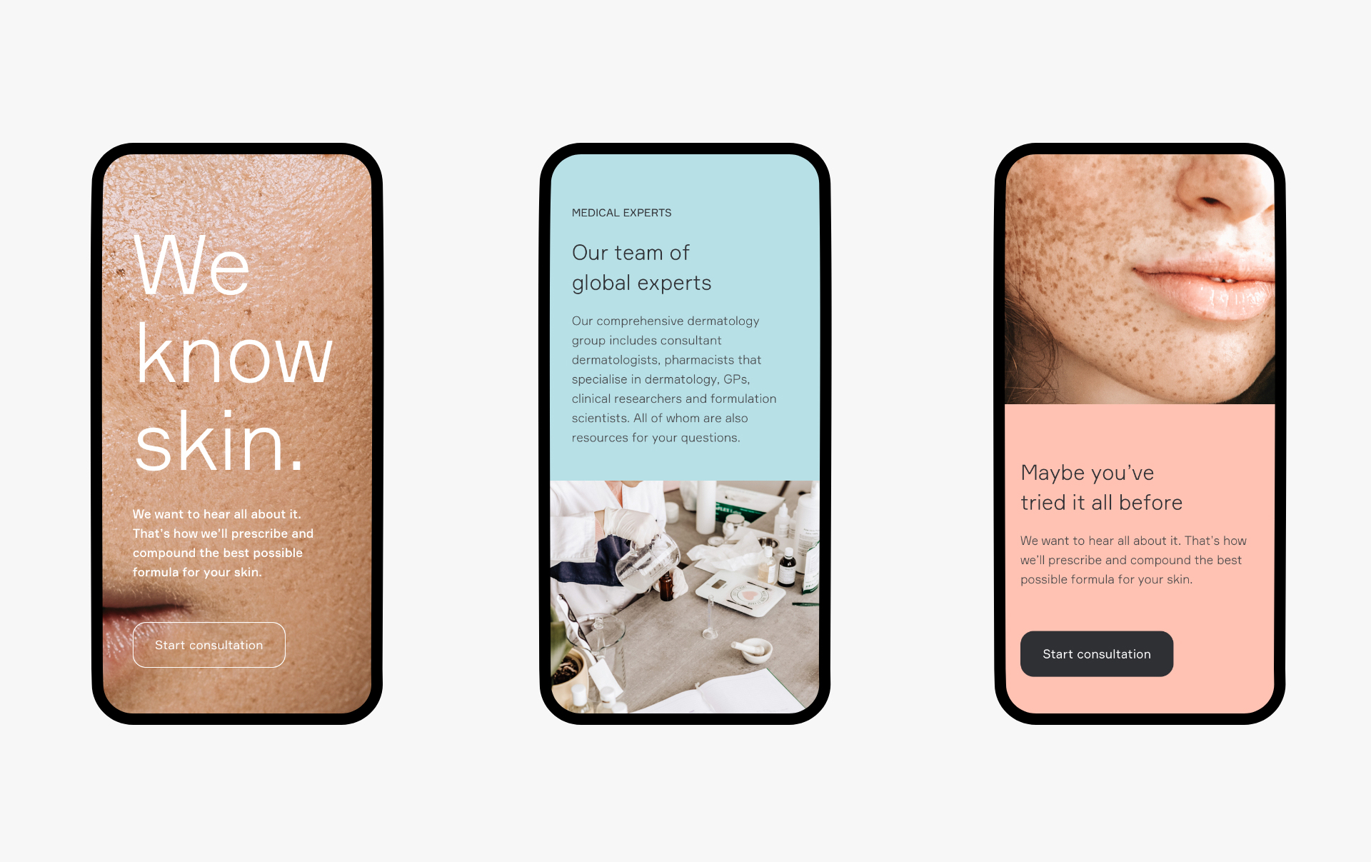
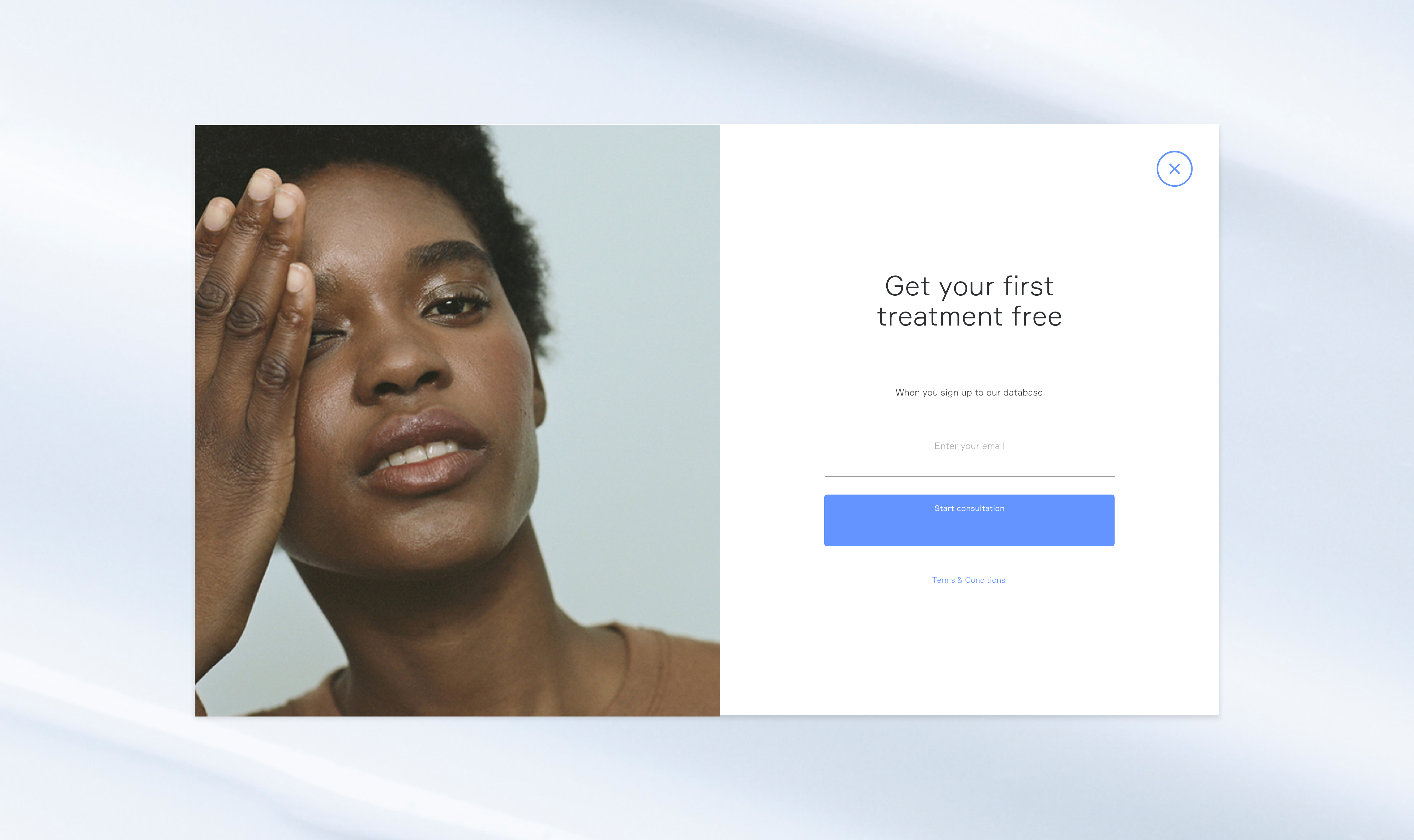
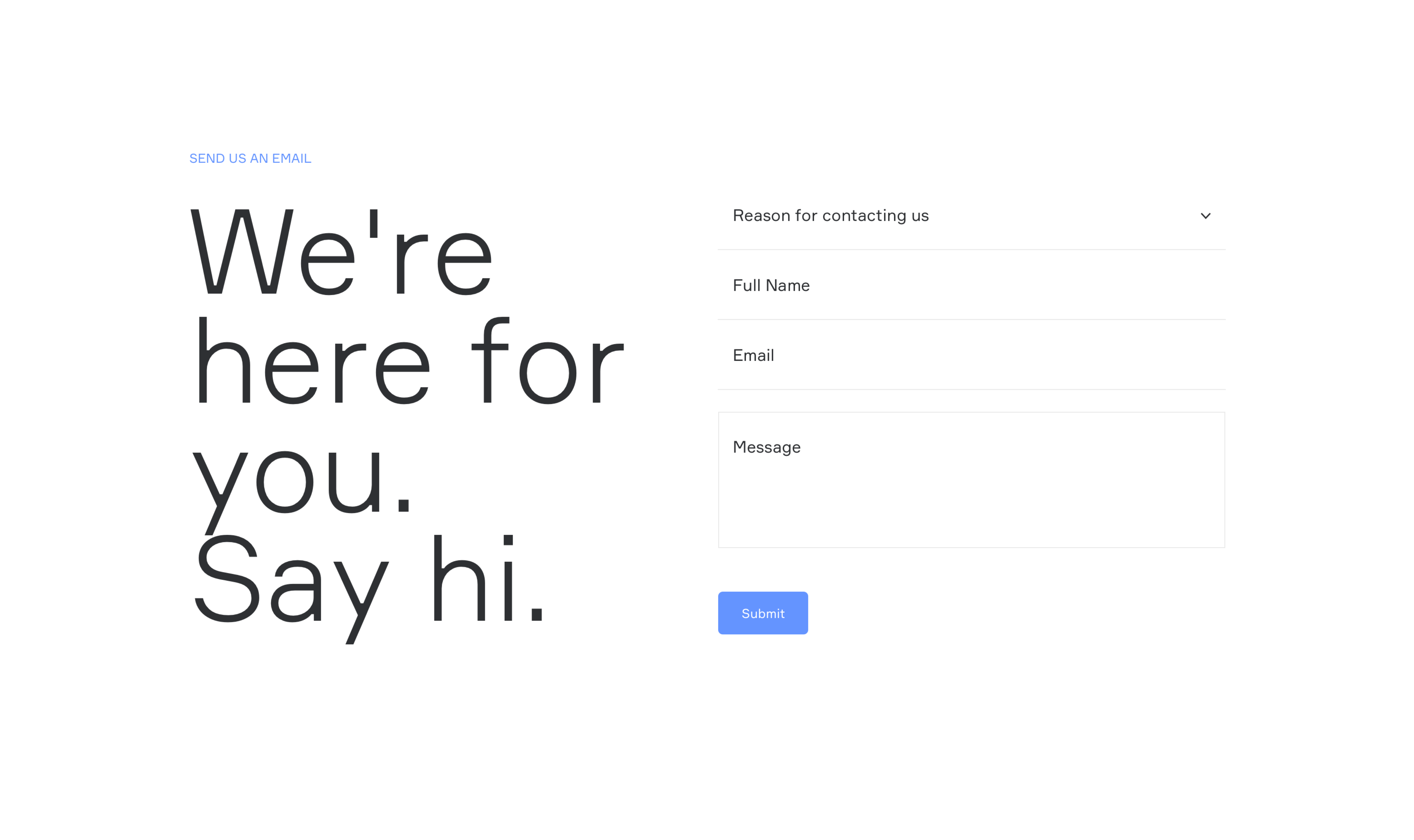
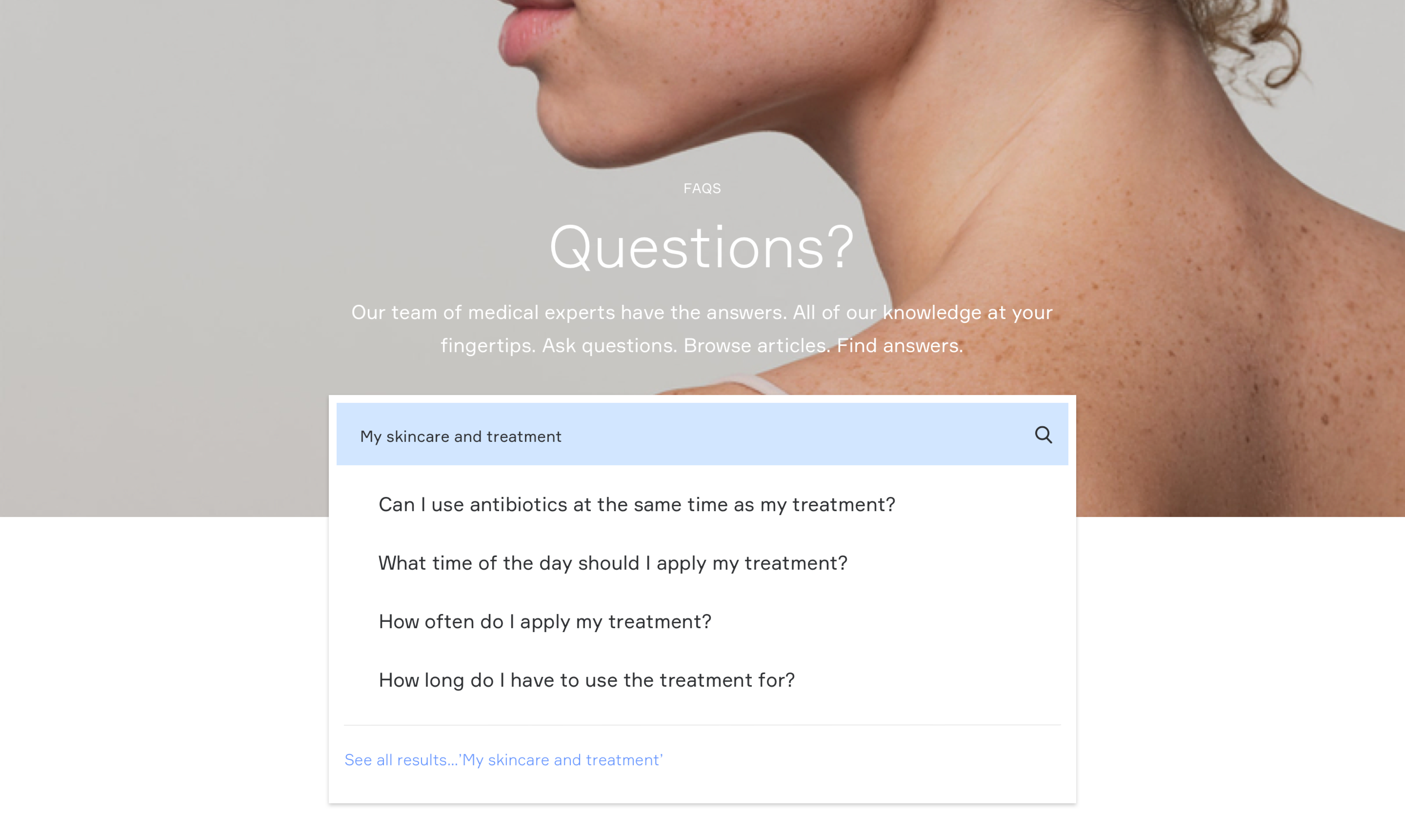

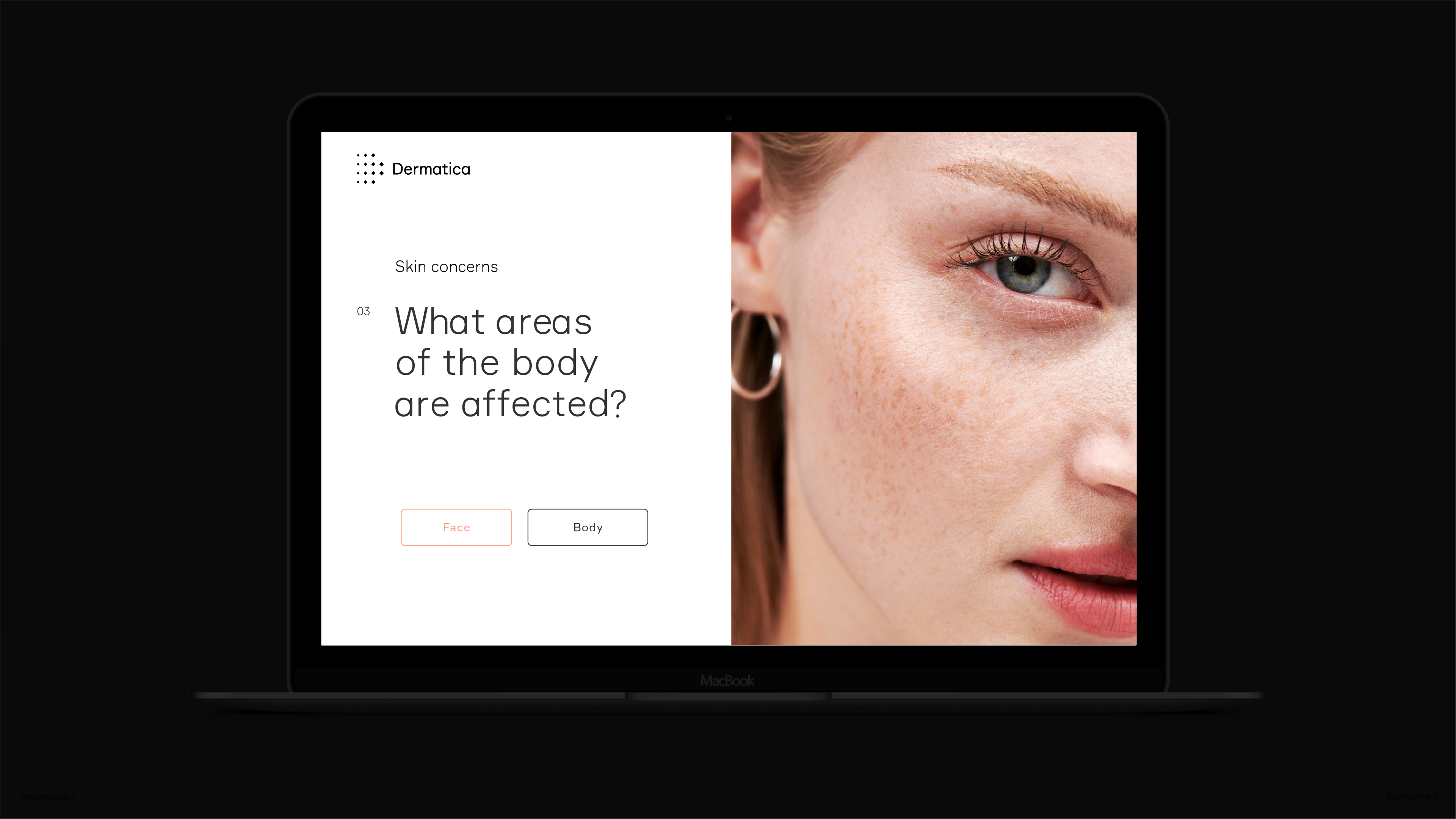
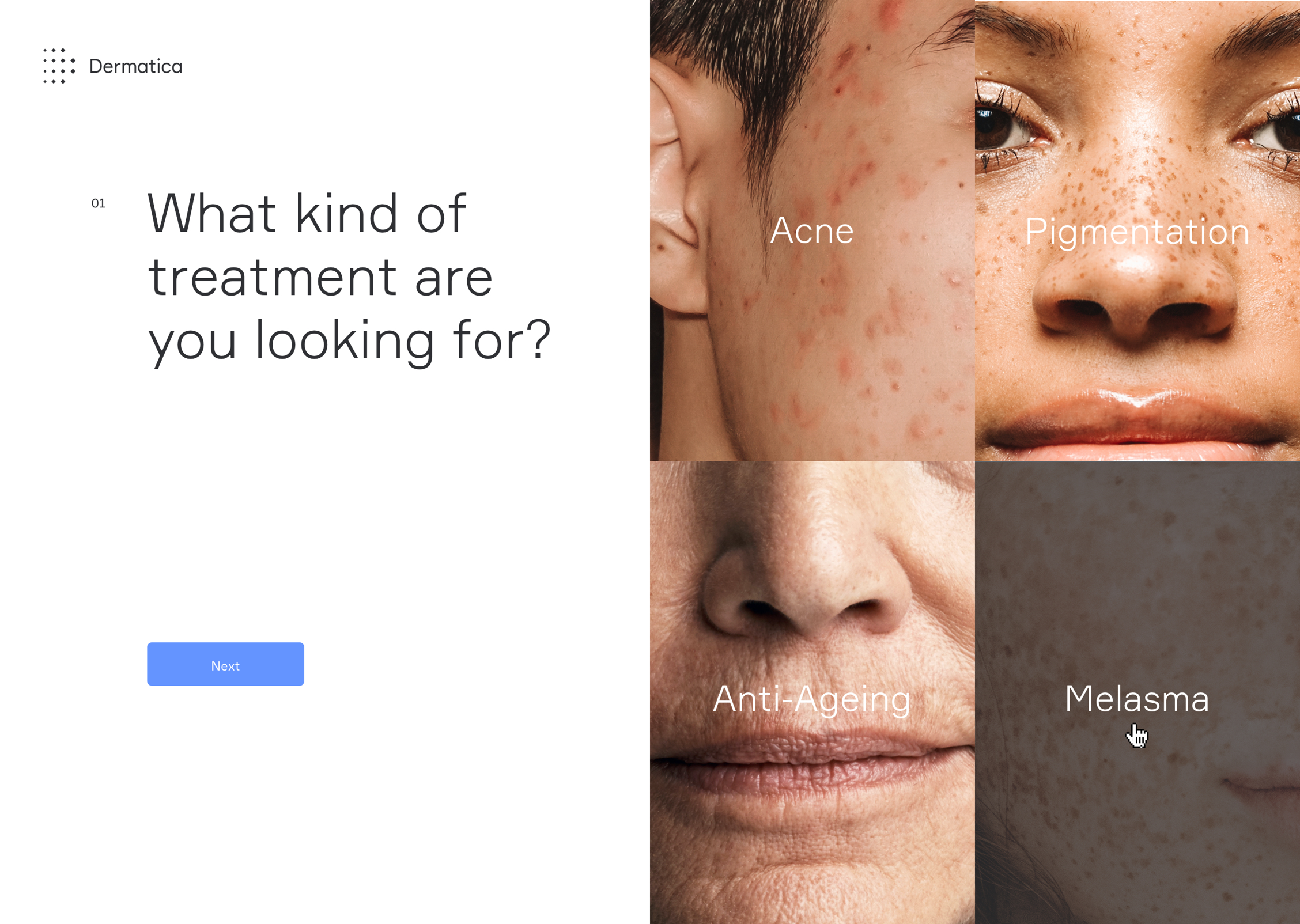
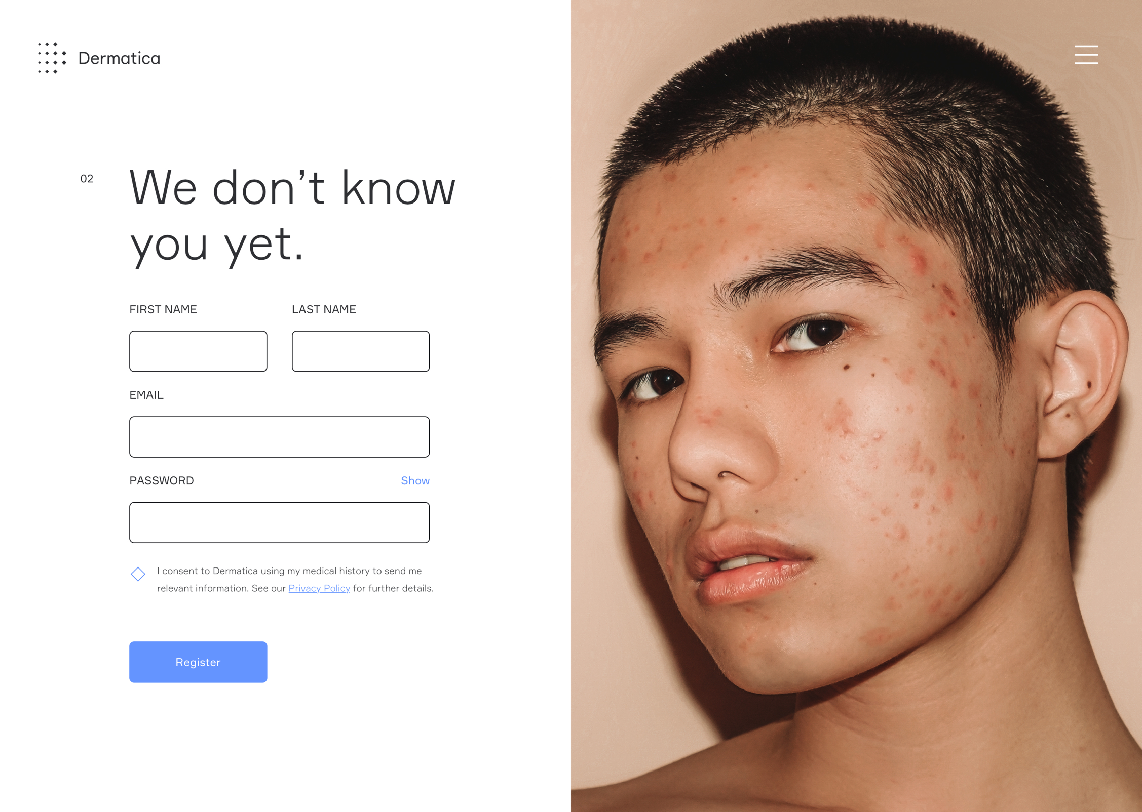
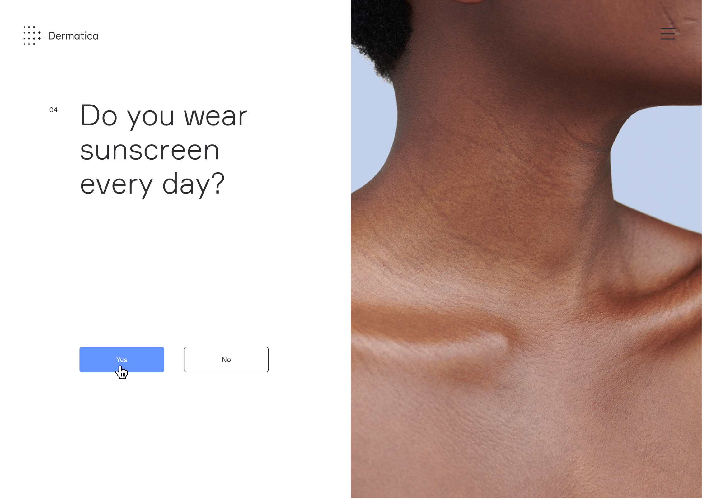
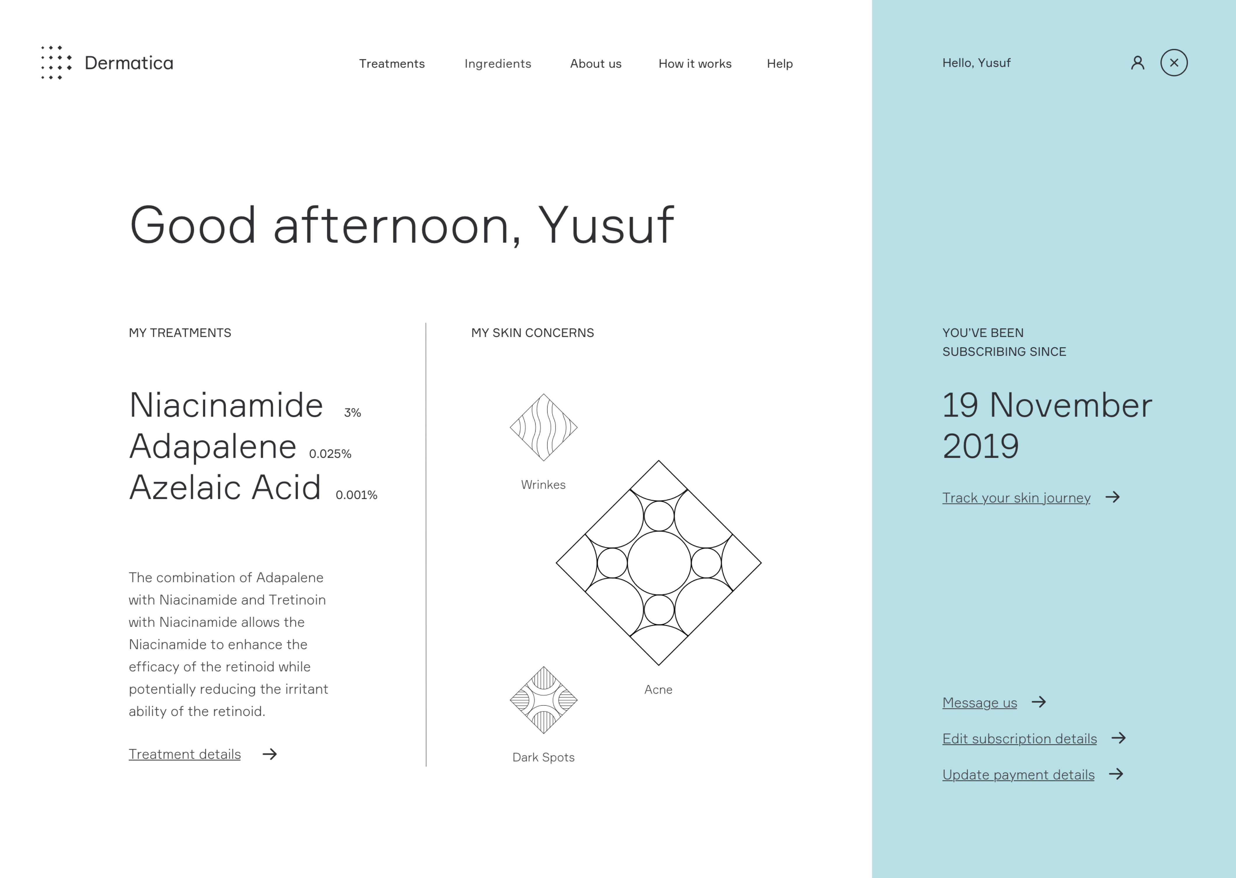
Skin Consultation
Following the insights gained from both the internal Dermatologists, Pharmacist, and customer support team we identified the requirements and key pain points with the existing user flow and patient dashboard. We identified the variation of user flows based on mapping both the customer requirements/skin concerns with the business offering. Specific customer flows were based on their skin concerns and medical history ensuring the team was able to capture the necessary medical and skin-related information to diagnose and subscribe to the patient with their bespoke treatment plan and formula.

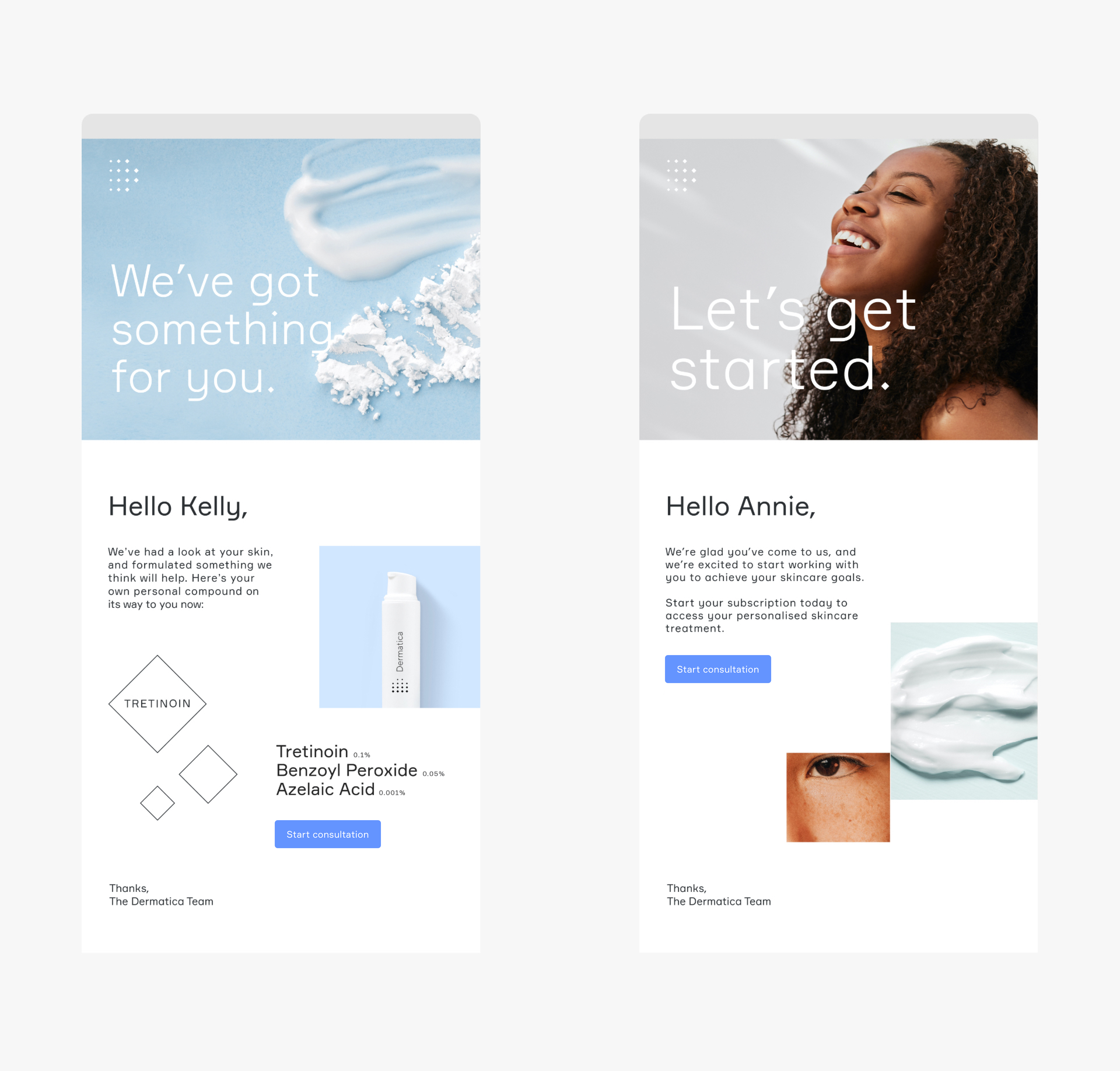
Automated emails.
Informed by the consulation process we were able to identify and build out a series of emails which were triggered by the actions of your subscribers completing steps with-in the process specifically structrured to consider thier skin condition or where with-in the flow they has droped off.
This in turn had an effect on the amount of emial the support team were experinces do user not have the correct informatyion of upadtes at the correct time.
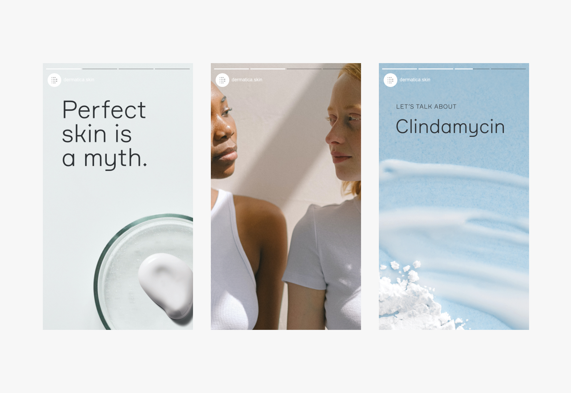
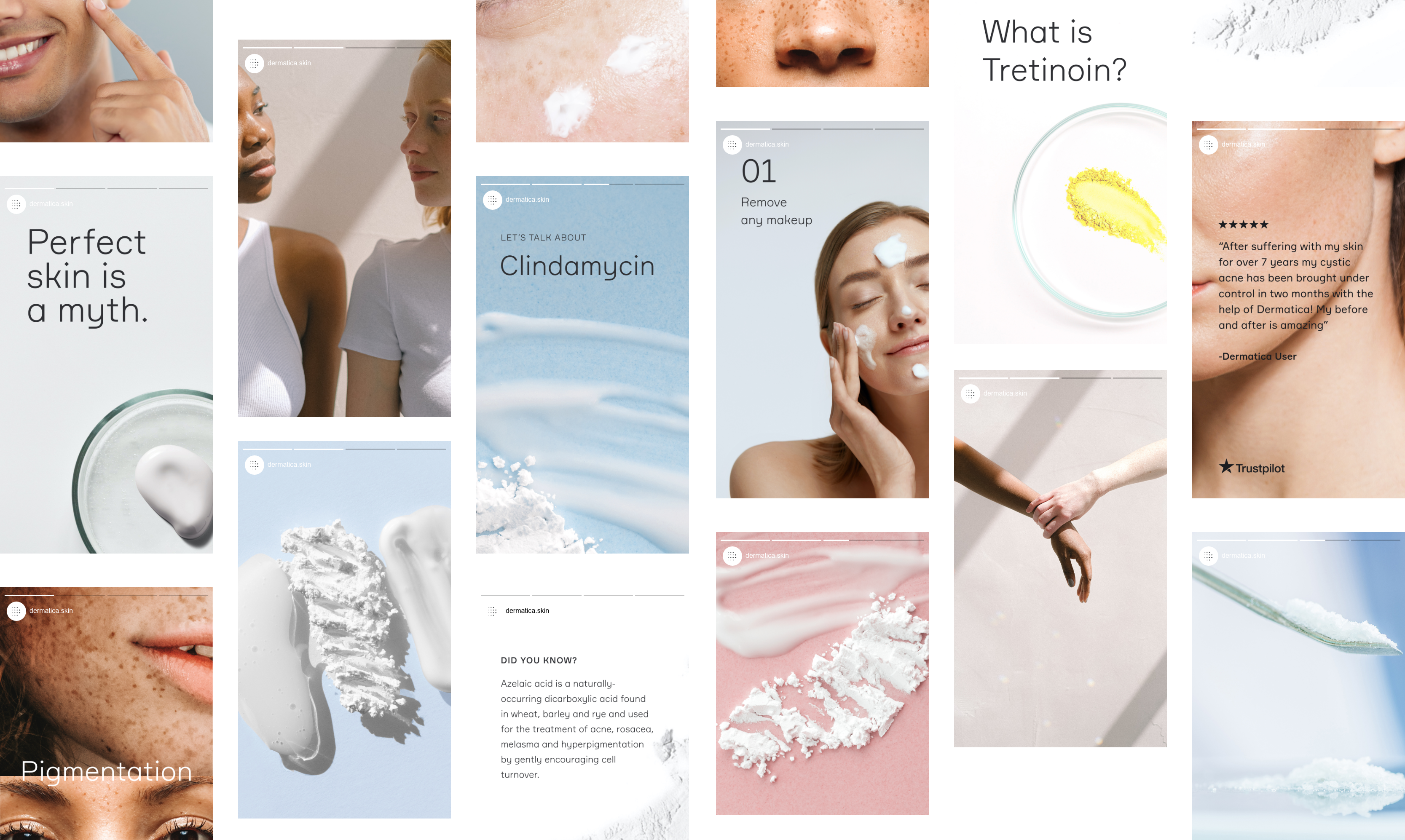
Social media makeover.
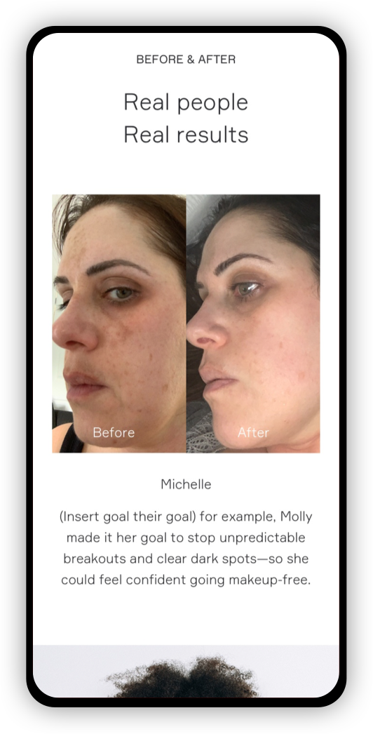
Using the new brand personality we built out a new Dermantica social media design system to better resonate with the defined target audience's requirements in mind. From ingredient-based information, patient "before and afters", to industry myth-busting content whilst retaining the scientific yet softer new look and feel. The result, rapid growth in new followers (approximately 6,000 organic followers) and strong engagement on Instagram within 2 months of launch.
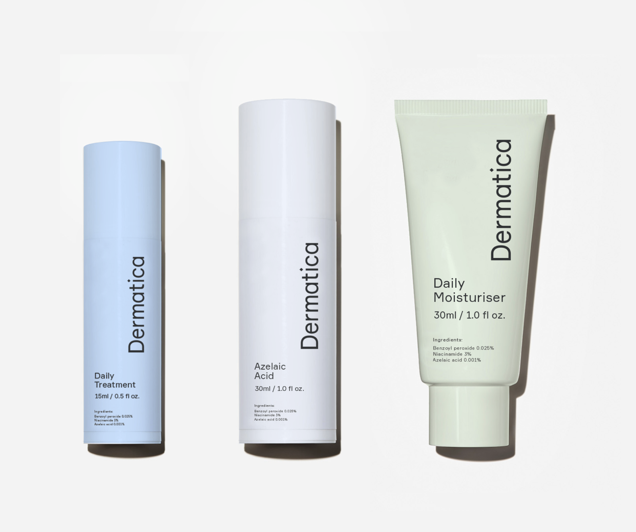
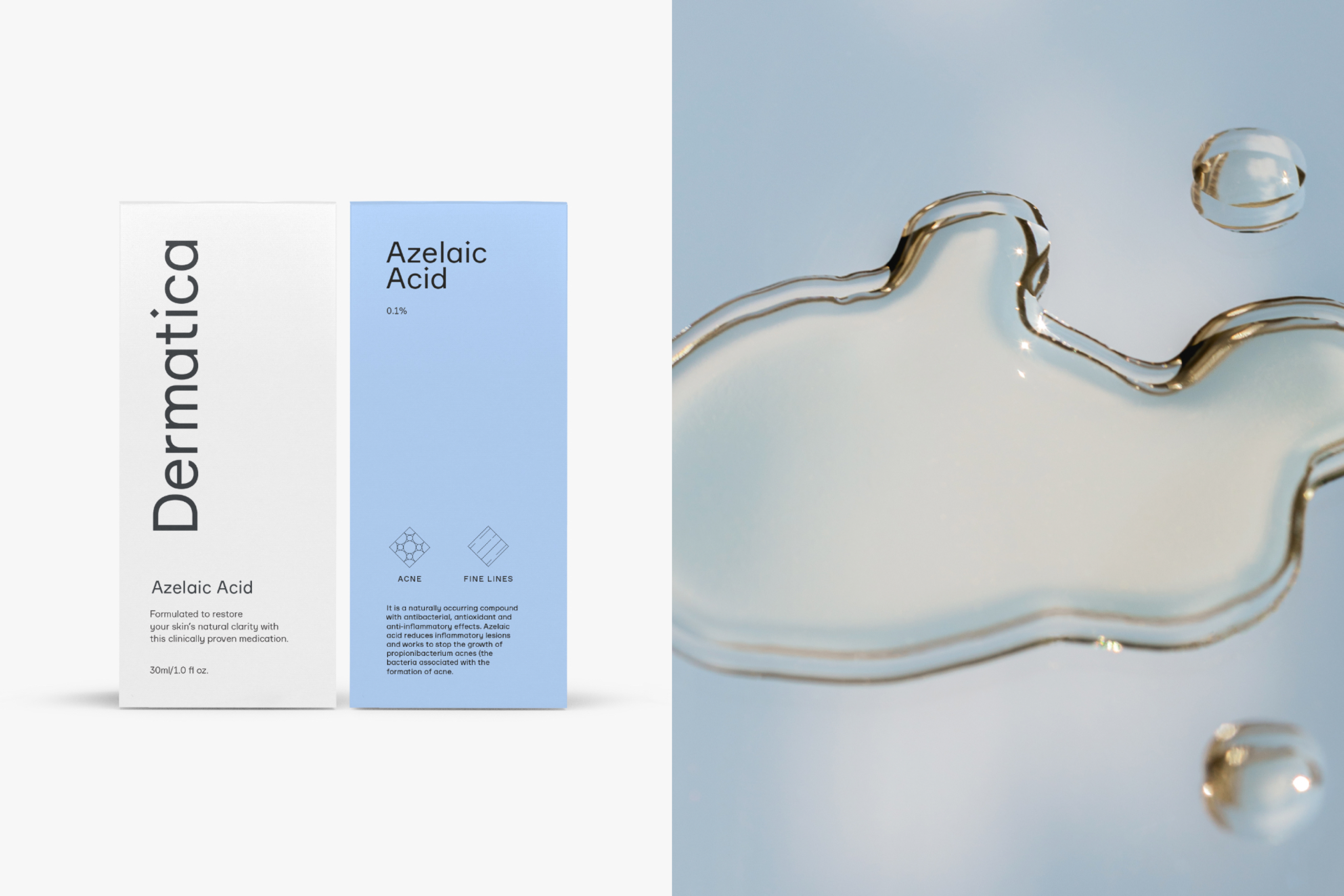
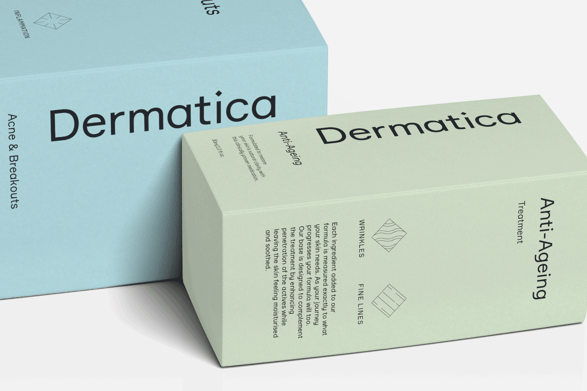
Product range and pump and outter packaging.
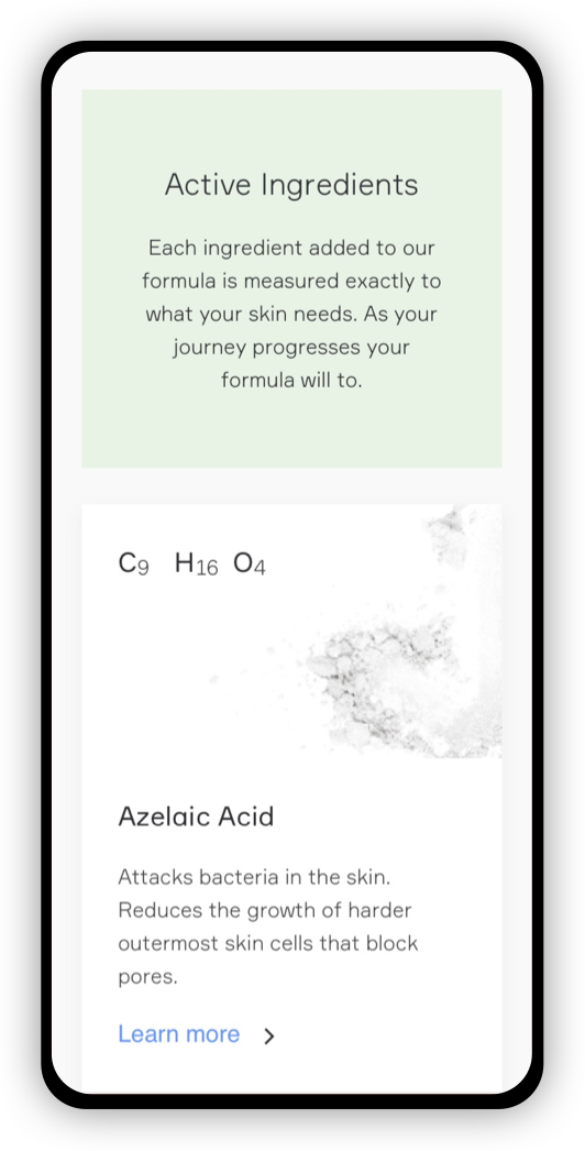
With the brand extending its product range to include specific treatments, ingredients, to accompany the hero bespoke personlaised cream we built out a product range that would differentiate the pumps form its competitirs whilst also keeping the focus on the daily peronslaised treatment cream.

Featured Works
HeightsSmart Probiotic

Land RoverChoose the right power
Rolls RoycePioneering the power that matters
SymriseAlways inspiring more...
Rolls Royce EVPBeyond tomorrow

FortnitemaresEPIC Games

Mortal Kombat 11It’s fuc*in Mortal Kombat
AscentialUnlock the future

PrudentialFreedom to face the future with confidence
MetaMerchComing soon
i love itComing soon
HOH
Get in touch
If you would like to know more, work with me or just meet me in person feel free to send email or message on any of my social media profiles.
Connect with me
E - yusuf@houseofhoosain.co
M - 079 0306 8195
L - Linkedin
I - Instagram